Case Study
the igda
The International Game Developers Association (IGDA) is “the largest non-profit membership organization in the world serving all individuals who create games.” With a focus on community, advocacy, and networking, I’ve been involved since late 2008 and have since become a lifetime member, part of the volunteer leadership, and their go-to-designer. I also served as art director of IGDA Perspectives for five years and named an MVP for my work.
The below describes the evolution of my work for the organization throughout the years.
Creative Process
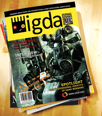
My very first project for the IGDA was a one-off magazine prototype. With more than 40 pages, it was my first attempt at designing so many pages of content in a way that unified the overall publication (little did I know I would soon regularly design 20-some page magazine-style spreads for them on a monthly basis). Eventually the work moved from individual pieces to a branding refresh, revisited annually for major events.
Check out the cover of the magazine prototype from way back in 2009.

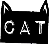
I also developed a logo for the effort, which combined the IGDA’s typeface with game controller elements.
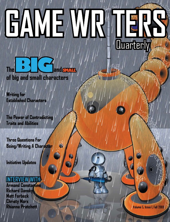
Later, I was invited to design a few covers for their Game Writers Special Interest Group publication.
Soon a branding refresh was born, which was a joint effort between myself and the talented Jack Bogdan. He created the new “swirl,” and I consulted on the font and implemented the look across the organization. We very carefully settled on a free-to-use font so that members could update their own materials as needed. The updated colors and shape still retained enough similarity to the old logo as to be recognizable, but it was a clear improvement on the original.
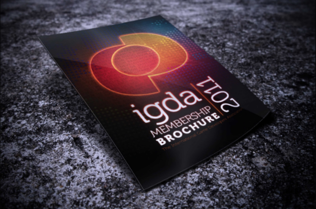
Following the logo update, it was very easy to make the organization’s visual materials more cohesive and appealing. I lead us into an era of tech-themed glow effects, like on the membership brochure cover.
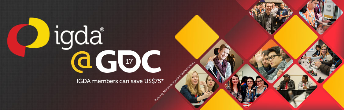
Here, members were the focus for a membership renewal push.
Most recently, we settled on a fresh, clean look for the organization that didn’t rely so heavily on dark, moody colors and flashy effects.
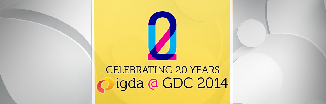
This piece combined elements for a special celebration of the organization’s 20th anniversary.
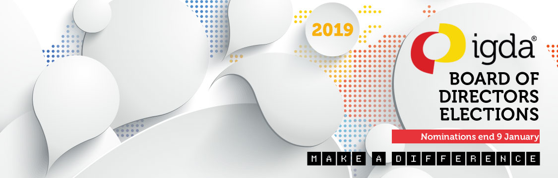
Finally, this is the most recent banner from the board of directors election cycle. The old dot map has come back into play while keeping things vibrant and alive.